Visualizing Datasets
Perform one of the following steps to visualize a dataset:
On the Datasets page, select the [Click for Actions] button beside the dataset that you want to view, and then click Visualize from the submenu that appears.
Click the Autoviz top menu link to go to the Visualizations list page, click the New Visualization button, then select or import the dataset that you want to visualize.
The Visualization Page
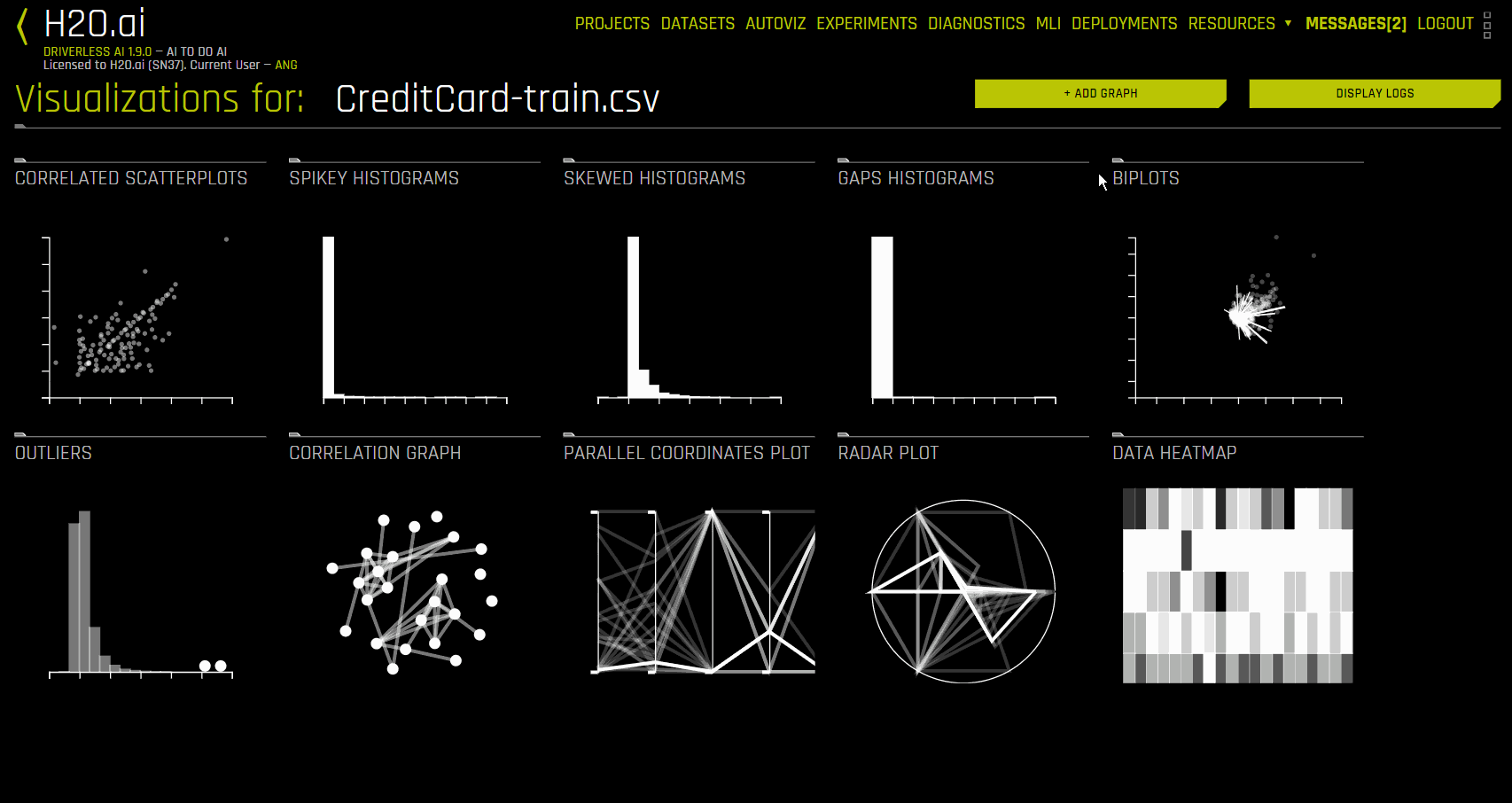
The Visualization page shows all available graphs for the selected dataset. Note that the graphs on the Visualization page can vary based on the information in your dataset. You can also view and download logs that were generated during the visualization.
The following is a complete list of available graphs.
Correlated Scatterplots: Correlated scatterplots are 2D plots with large values of the squared Pearson correlation coefficient. All possible scatterplots based on pairs of features (variables) are examined for correlations. The displayed plots are ranked according to the correlation. Some of these plots may not look like textbook examples of correlation. The only criterion is that they have a large value of squared Pearson’s r (greater than .95). When modeling with these variables, you may want to leave out variables that are perfectly correlated with others.
Note that points in the scatterplot can have different sizes. Because Driverless AI aggregates the data and does not display all points, the bigger the point is, the bigger number of exemplars (aggregated points) the plot covers.
Spikey Histograms: Spikey histograms are histograms with huge spikes. This often indicates an inordinate number of single values (usually zeros) or highly similar values. The measure of “spikeyness” is a bin frequency that is ten times the average frequency of all the bins. You should be careful when modeling (particularly regression models) with spikey variables.
Skewed Histograms: Skewed histograms are ones with especially large skewness (asymmetry). The robust measure of skewness is derived from Groeneveld, R.A. and Meeden, G. (1984), “Measuring Skewness and Kurtosis.” The Statistician, 33, 391-399. Highly skewed variables are often candidates for a transformation (e.g., logging) before use in modeling. The histograms in the output are sorted in descending order of skewness.
Varying Boxplots: Varying boxplots reveal unusual variability in a feature across the categories of a categorical variable. The measure of variability is computed from a robust one-way analysis of variance (ANOVA). Sufficiently diverse variables are flagged in the ANOVA. A boxplot is a graphical display of the fractiles of a distribution. The center of the box denotes the median, the edges of a box denote the lower and upper quartiles, and the ends of the “whiskers” denote that range of values. Sometimes outliers occur, in which case the adjacent whisker is shortened to the next lower or upper value. For variables (features) having only a few values, the boxes can be compressed, sometimes into a single horizontal line at the median.
Heteroscedastic Boxplots: Heteroscedastic boxplots reveal unusual variability in a feature across the categories of a categorical variable. Heteroscedasticity is calculated with a Brown-Forsythe test: Brown, M. B. and Forsythe, A. B. (1974), “Robust tests for equality of variances. Journal of the American Statistical Association, 69, 364-367. Plots are ranked according to their heteroscedasticity values. A boxplot is a graphical display of the fractiles of a distribution. The center of the box denotes the median, the edges of a box denote the lower and upper quartiles, and the ends of the “whiskers” denote that range of values. Sometimes outliers occur, in which case the adjacent whisker is shortened to the next lower or upper value. For variables (features) having only a few values, the boxes can be compressed, sometimes into a single horizontal line at the median.
Biplots: A Biplot is an enhanced scatterplot that uses both points and vectors to represent structure simultaneously for rows and columns of a data matrix. Rows are represented as points (scores), and columns are represented as vectors (loadings). The plot is computed from the first two principal components of the correlation matrix of the variables (features). You should look for unusual (non-elliptical) shapes in the points that might reveal outliers or non-normal distributions. And you should look for purple vectors that are well-separated. Overlapping vectors can indicate a high degree of correlation between variables.
Outliers: Variables with anomalous or outlying values are displayed as red points in a dot plot. Dot plots are constructed using an algorithm in Wilkinson, L. (1999). “Dot plots.” The American Statistician, 53, 276–281. Not all anomalous points are outliers. Sometimes the algorithm will flag points that lie in an empty region (i.e., they are not near any other points). You should inspect outliers to see if they are miscodings or if they are due to some other mistake. Outliers should ordinarily be eliminated from models only when there is a reasonable explanation for their occurrence.
Correlation Graph: The correlation network graph is constructed from all pairwise squared correlations between variables (features). For continuous-continuous variable pairs, the statistic used is the squared Pearson correlation. For continuous-categorical variable pairs, the statistic is based on the squared intraclass correlation (ICC). This statistic is computed from the mean squares from a one-way analysis of variance (ANOVA). The formula is (MSbetween - MSwithin)/(MSbetween + (k - 1)MSwithin), where k is the number of categories in the categorical variable. For categorical-categorical pairs, the statistic is computed from Cramer’s V squared. If the first variable has k1 categories and the second variable has k2 categories, then a k1 x k2 table is created from the joint frequencies of values. From this table, we compute a chi-square statistic. Cramer’s V squared statistic is then (chi-square / n) / min(k1,k2), where n is the total of the joint frequencies in the table. Variables with large values of these respective statistics appear near each other in the network diagram. The color scale used for the connecting edges runs from low (blue) to high (red). Variables connected by short red edges tend to be highly correlated.
Parallel Coordinates Plot: A Parallel Coordinates Plot is a graph used for comparing multiple variables. Each variable has its own vertical axis in the plot. Each profile connects the values on the axes for a single observation. If the data contain clusters, these profiles will be colored by their cluster number.
Radar Plot: A Radar Plot is a two-dimensional graph that is used for comparing multiple variables. Each variable has its own axis that starts from the center of the graph. The data are standardized on each variable between 0 and 1 so that values can be compared across variables. Each profile, which usually appears in the form of a star, connects the values on the axes for a single observation. Multivariate outliers are represented by red profiles. The Radar Plot is the polar version of the popular Parallel Coordinates plot. The polar layout enables us to represent more variables in a single plot.
Data Heatmap: The heatmap graphic is constructed from the transposed data matrix. Rows of the heatmap represent variables, and columns represent cases (instances). The data are standardized before display so that small values are yellow and large values are red. The rows and columns are permuted via a singular value decomposition (SVD) of the data matrix so that similar rows and similar columns are near each other.
Recommendations: The recommendations graphic implements the Tukey ladder of powers collection of log, square root, and inverse data transformations described in Exploratory Data Analysis (Tukey, 1977). Also implemented are extensions of these three transformers that handle negative values, which are derived from I.K. Yeo and R.A. Johnson, “A new family of power transformations to improve normality or symmetry.” Biometrika, 87(4), (2000). For each transformer, transformations are selected by comparing the robust skewness of the transformed column with the robust skewness of the original raw column. When a transformation leads to a relatively low value of skewness, it is recommended.
Missing Values Heatmap: The missing values heatmap graphic is constructed from the transposed data matrix. Rows of the heatmap represent variables and columns represent cases (instances). The data are coded into the values 0 (missing) and 1 (nonmissing). Missing values are colored red and nonmissing values are left blank (white). The rows and columns are permuted via a singular value decomposition (SVD) of the data matrix so that similar rows and similar columns are near each other.
Gaps Histogram: The gaps index is computed using an algorithm of Wainer and Schacht based on work by John Tukey. (Wainer, H. and Schacht, Psychometrika, 43, 2, 203-12.) Histograms with gaps can indicate a mixture of two or more distributions based on possible subgroups not necessarily characterized in the dataset.
The images on this page are thumbnails. You can click on any of the graphs to view and download a full-scale image. You can also view an explanation for each graph by clicking the Help button in the lower-left corner of each expanded graph.
Creating Custom Plots
To create a custom plot, click the Add Graph button in the upper-right corner and select one of the following plot types:
Bar chart: This plot presents categorical data with rectangular bars that are proportional to the values they represent. The type of marker used to represent bars determines the bar chart type. The most common marker is the bar marker, which ranges from a lower value (usually zero) to an upper value. Also available are the Cleveland dot plot (replaces the bar with a dot located at the upper value) and the area chart (covers the bars with a solid area marker). Bars are always plotted against the categories of a categorical variable. They may represent counts (if no y variable is specified) or the average value of the y variable per category (if the y variable is specified).
When creating a bar chart, specify the following options:
x variable name: Specify the name of the x variable
y variable name: Specify the name of the y variable
Transpose: Specify whether to switch the X-axis and Y-axis
Sort: Specify whether to sort bars alphabetically by x values
Mark: Specify a marker type. Select point to create a Cleveland dot plot
Boxplot: This plot presents the fractiles of a distribution. The center of the box represents the median, the edges of a box represent the lower and upper quartiles, and the ends of the “whiskers” represent that range of values. When outliers occur, the adjacent whisker is shortened to the next lower or upper value. For variables having only a few values, the boxes can be compressed.
When creating a boxplot, specify the following options:
Variable name: Specify the variable that you want the box to represent
Transpose: Specify whether to switch the X-axis and Y-axis
Dotplot: This plot represents individual data values with dots. When more than one value falls within a small neighborhood, the dots are stacked.
When creating a dotplot, specify the following options:
Variable name: Specify the name of the variable on which dots are calculated
Mark: Specify a marker type
Grouped Boxplot: This plot is a boxplot where categories are organized into groups and subgroups.
When creating a grouped boxplot, specify the following options:
Variable name: Specify the variable that you want the box to represent
Group variable name: Specify the name of the grouping variable
Transpose: Specify whether to switch the X-axis and Y-axis
Heatmap - See data heatmap. When creating a heatmap, specify the following options:
Variable names: Specify one or more variables to use. If none are specified, all the variables in the dataset are used
Permute: Specify whether to reorder variables using singular value decomposition (SVD)
Transpose: Specify whether to switch the X-axis and Y-axis
Matrix type: Specify a matrix type. Choose from rectangular and symmetric
Histogram: This plot is a graphical display of data that uses bars of differing height. Each bar groups numbers into ranges by its width, and taller bars show that more data falls within a specific range. This plot is often used to display the shape and spread of a continuous variable.
When creating a histogram, specify the following options:
Variable name: Specify the variable name
Transformation: Specify whether to use a transformation. Choose from log and square root
Number of bars: Specify the number of bars to use
Mark: Specify a marker type. Use area to create a density polygon
Linear Regression: This plot predicts a set of values on a variable y from values on a variable x by fitting a linear function (\(ax + b\)) so that for any value on the x variable, this function yields the most probable value on the y variable. The effectiveness of this prediction in a sample of values is represented by the discrepancies between the y values and their corresponding predicted values.
When creating a linear regression plot, specify the following options:
x variable name: Specify the name of the x variable
y variable name: Specify the name of the y variable
Mark: Specify a marker type. Choose from point and square
LOESS Regression: This plot predicts a set of values on a variable y from values on a variable x by fitting a locally linear function (\(ax + b\)) that determines the most probable y variable values based on the available x variable values. The effectiveness of this prediction in a sample of values is represented by the discrepancies between the y values and their corresponding predicted values.
When creating a LOESS regression plot, specify the following options:
x variable name: Specify the name of the x variable
y variable name: Specify the name of the y variable
Mark: Specify a marker type. Choose from point and square
Bandwidth: Specify the interval that represents the proportion of cases during the smoothing window. This is set to 0.5 by default
Parallel Coordinates Plot: This plot is used for comparing multiple variables. Each variable has its own vertical axis in the plot, and each profile connects the values on the axes for a single observation. If the data contains clusters, these profiles are color-coded by their cluster number.
When creating a parallel coordinates plot, specify the following options:
Variable names: Specify one or more variables to use. If none are specified, all the variables in the dataset are used
Permute: Specify whether to reorder variables using singular value decomposition (SVD)
Transpose: Specify whether to switch the X-axis and Y-axis
Cluster: Specify whether to include k-Means cluster variables. Unique colors are assigned for each cluster ID
Probability Plot: This plot evaluates the skewness of a distribution by plotting two cumulative distribution functions against each other.
When creating a probability plot, specify the following options:
x variable name: Specify the name of the x variable
Distribution: Specify a distribution type. Choose from normal and uniform
Mark: Specify a marker type. Choose from point and square
Transpose: Specify whether to switch the X-axis and Y-axis
Quantile Plot: This plot compares two probability distributions by plotting their quantiles against each other.
When creating a quantile plot, specify the following options:
x variable name: Specify the name of the x variable
y variable name: Specify the name of the y variable
Distribution: Specify a distribution type. Choose from normal and uniform
Mark: Specify a marker type. Choose from point and square
Transpose: Specify whether to switch the X-axis and Y-axis
Scatterplot: This plot represents the values of two variables (y and x) in a frame that contains one point for each row of the input sample data. They are useful for analyzing the joint distribution of two variables.
When creating a scatterplot, specify the following options:
x variable name: Specify the name of the x variable
y variable name: Specify the name of the y variable
Mark: Specify a marker type. Choose from point and square
After selecting a plot, configure the available settings for that plot type and click Save. The custom plot appears on the Visualization page once it has been created.
The following example creates a custom histogram plot for the CreditCard-Train dataset: