Understanding the Model Interpretation Page
This section describes the features on the Model Interpretation page for non-time-series experiments.
The Model Interpretation page is organized into three tabs:
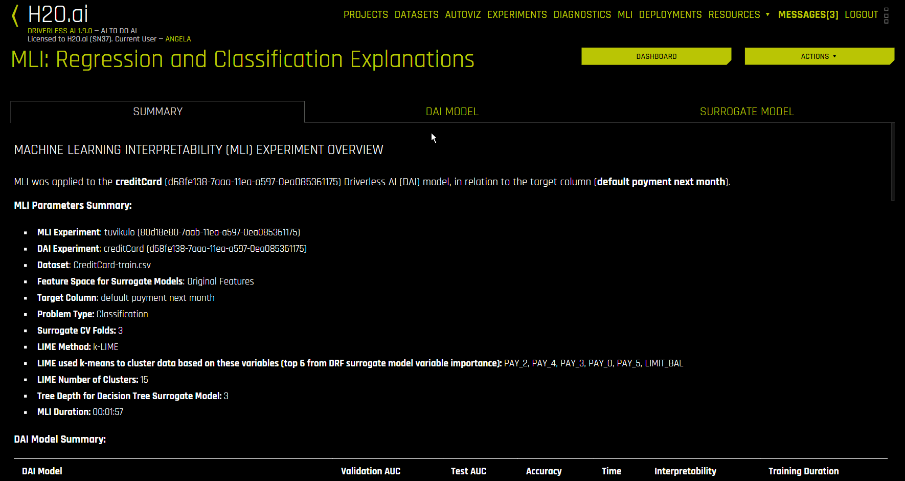
The Summary tab provides an overview of the interpretation, including the dataset and Driverless AI experiment (if available) that were used for the interpretation along with the feature space (original or transformed), target column, problem type, and k-Lime information. If the interpretation was created from a Driverless AI model, then a table with the Driverless AI model summary is also included along with the top variables for the model.
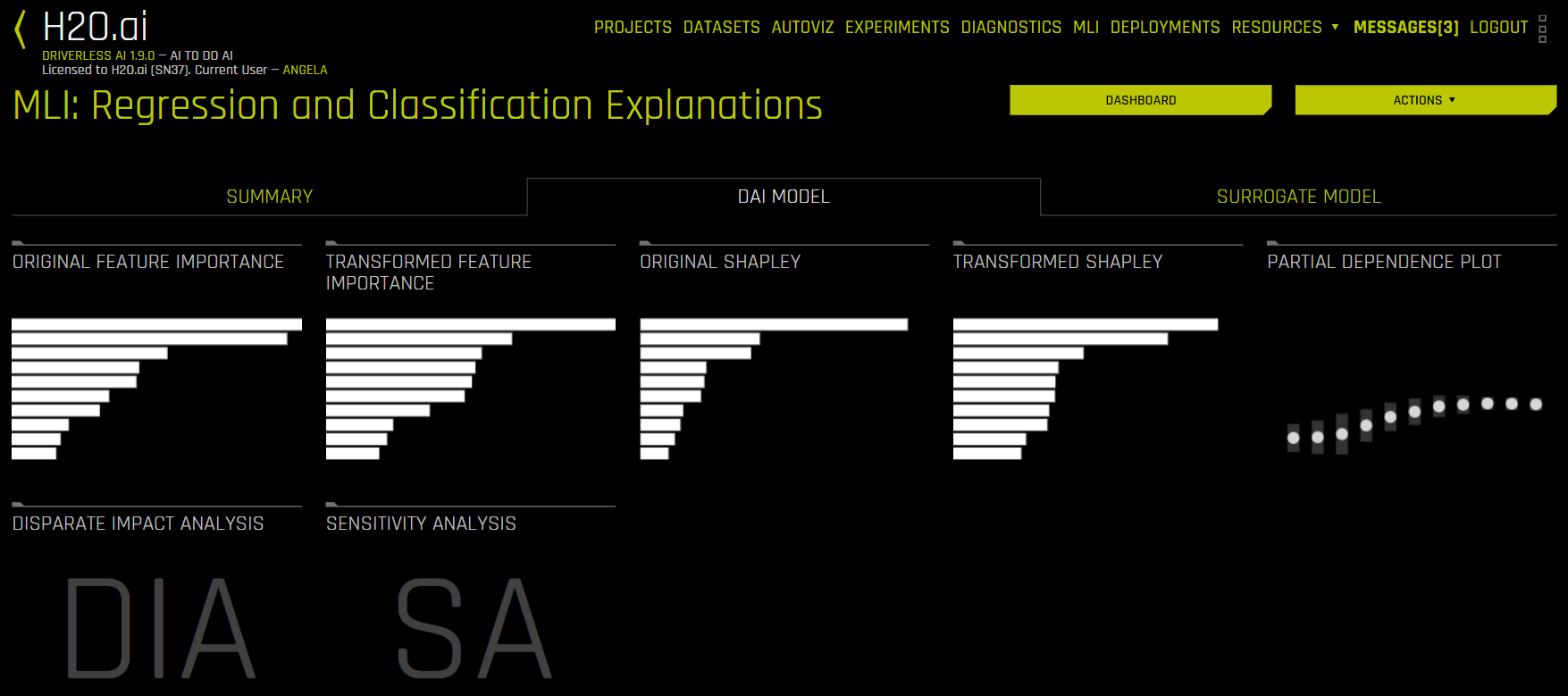
The DAI Model tab is organized into tiles for each interpretation method. To view a specific plot, click the tile for the plot that you want to view.
For binary classification and regression experiments, this tab includes Feature Importance and Shapley (not supported for RuleFit and TensorFlow models) plots for original and transformed features as well as Partial Dependence/ICE, Disparate Impact Analysis (DIA), Sensitivity Analysis, NLP Tokens and NLP LOCO (for text experiments), and Permutation Feature Importance (if the autodoc_include_permutation_feature_importance configuration option is enabled) plots. For multiclass classification experiments, this tab includes Feature Importance and Shapley plots for original and transformed features. See the DAI Model Tab Plots section for more information on these plots.
Notes:
Shapley plots are not supported for RuleFit, FTRL, and TensorFlow models.
Shapley plots are only supported for BYOR models that implement the
has_pred_contribsmethod (and returnTrue) and implement proper handling of the argumentpred_contribs=Truein the predict method.The Permutation-based feature importance plot is only available when the
autodoc_include_permutation_feature_importanceconfiguration option is enabled when starting Driverless AI or when starting the experiment.On the Feature Importance and Shapley plots, the transformed feature names are encoded as follows:
<transformation/gene_details_id>_<transformation_name>:<orig>:<…>:<orig>.<extra>
So in
32_NumToCatTE:BILL_AMT1:EDUCATION:MARRIAGE:SEX.0, for example:32_is the transformation index for specific transformation parameters.NumToCatTEis the tranformation type.BILL_AMT1:EDUCATION:MARRIAGE:SEXrepresent original features used.0represents the likelihood encoding for target[0] after grouping by switch and making out-of-fold estimates. For multiclass experiments this value will be > 0. For binary experiments, this value will always be 0.
A surrogate model is a data mining and engineering technique in which a generally simpler model is used to explain another, usually more complex, model or phenomenon. For example, the decision tree surrogate model is trained to predict the predictions of the more complex Driverless AI model using the original model inputs. The trained surrogate model enables a heuristic understanding (i.e., not a mathematically precise understanding) of the mechanisms of the highly complex and nonlinear Driverless AI model.
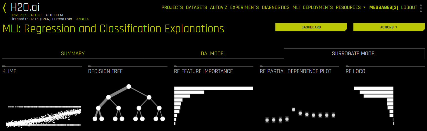
The Surrogate Model tab is organized into tiles for each interpretation method. To view a specific plot, click the tile for the plot that you want to view. For binary classification and regression experiments, this tab includes K-LIME/LIME-SUP and Decision Tree plots as well as Feature Importance, Partial Dependence, and LOCO plots for the Random Forest surrogate model. See the Surrogate Model Tab Plots section for more information on these plots.
Note: For multiclass classification experiments, only the Decision Tree and Random Forest Feature Importance plots are available in this tab.
The Model Interpretation page also features the Dashboard and Actions buttons, which are located in the upper-right corner:
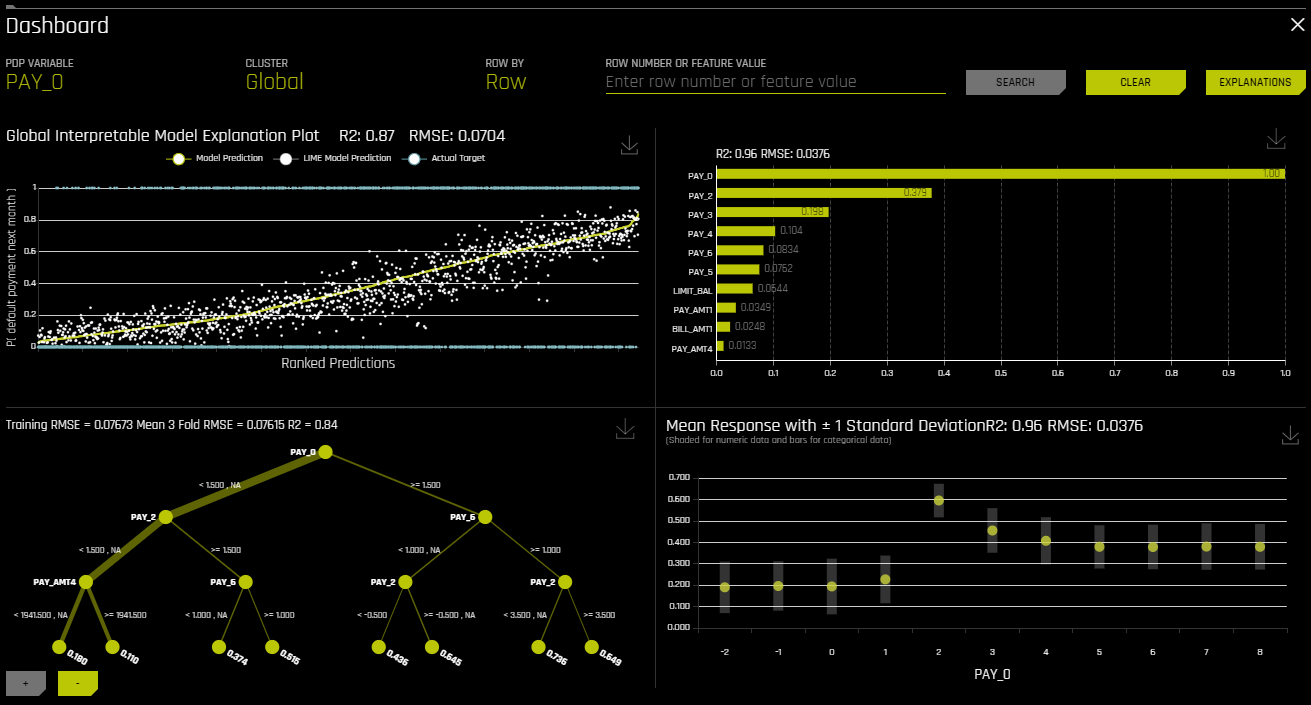
Click the Dashboard button to view the Dashboard page. For binary classification and regression experiments, the Dashboard page provides a single page with the following surrogate plots:
Global Interpretable Model Explanations
Feature Importance
Decision Tree
Partial Dependence
You can also view explanations from this page by clicking the Explanations button located in the upper-right corner. Refer to the Viewing Explanations section for more information.
Note: The Dashboard is not available for multiclass classification experiments.
Click the Actions button to view the following options:
Go to MLI Documentation: View the Machine Learning Interpetability section of the Driverless AI documentation.
Download MLI Logs: Download a ZIP file of the logs that were generated during the interpretation.
Go to Experiment: View the experiment that was used to generate the interpretation.
Download Scoring Pipeline: For binomial and regression experiments, download the scoring pipeline for the interpretation. This option is not available for multinomial experiments.
Download Reason Codes LIME: For binomial experiments, download a CSV file of LIME reason codes.
Download Reason Codes Shapley: For regression, binary, and multinomial experiments, download a CSV file of Shapley reason codes.
Display MLI Java Logs: View MLI Java logs for the interpretation.
Display MLI Python Logs: View MLI Python logs for the interpretation.
Download Decision Tree Surrogate Rules: Download text and Python files of decision tree surrogate model rules for the interpretation.
Download Reason Codes Original Shapley (Kernel Shapley): For regression, binary, and multinomial experiments, download a CSV file of Original Shapley reason codes.
DAI Model Tab Plots
This section describes the plots that are available in the DAI Model Tab.
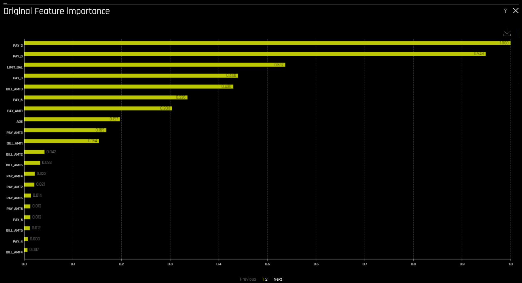
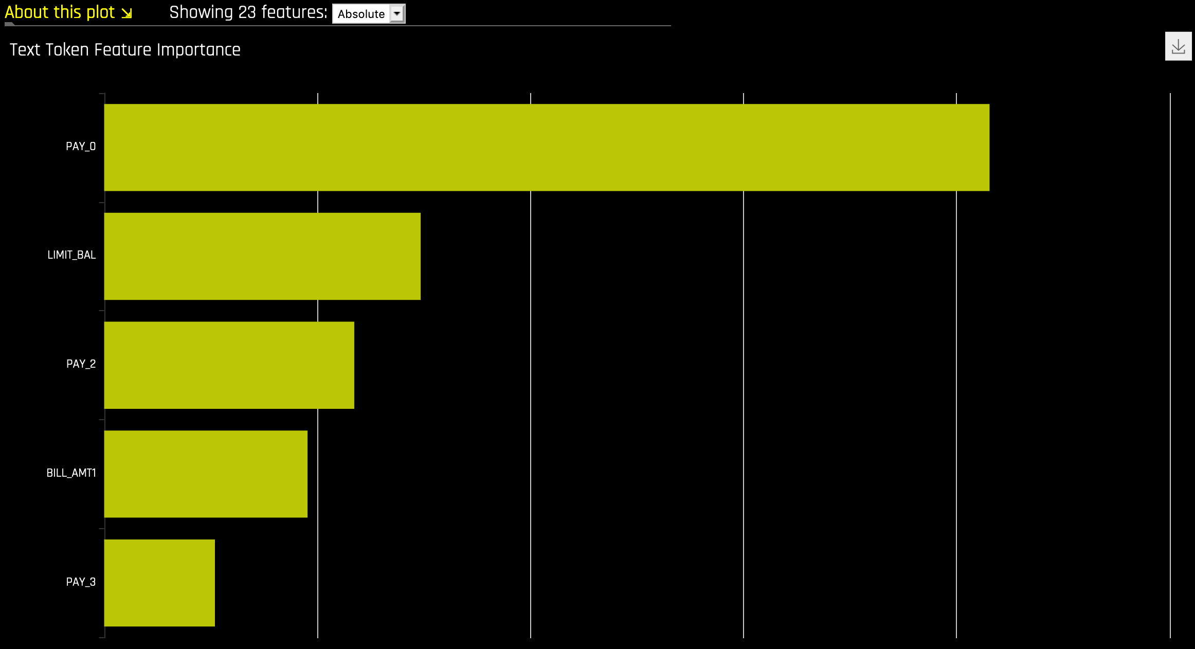
Feature Importance (Original and Transformed Features)
This plot is available for all models for binary classification, multiclass classification, and regression experiments.
This plot shows the Driverless AI feature importance. Driverless AI feature importance is a measure of the contribution of an input variable to the overall predictions of the Driverless AI model.
Shapley (Original and Transformed Features)
This plot is not available for RuleFit or TensorFlow models. For all other models, this plot is available for binary classification, multiclass classification, and regression experiments.
Shapley explanations are a technique with credible theoretical support that presents consistent global and local variable contributions. Local numeric Shapley values are calculated by tracing single rows of data through a trained tree ensemble and aggregating the contribution of each input variable as the row of data moves through the trained ensemble. For regression tasks, Shapley values sum to the prediction of the Driverless AI model. For classification problems, Shapley values sum to the prediction of the Driverless AI model before applying the link function. Global Shapley values are the average of the absolute Shapley values over every row of a dataset.
Notes:
Shapley values for transformed features are calculated by tracing individual rows of data through a trained tree ensemble and then aggregating the contribution of each input variable as the row of data moves through the trained ensemble. More information about Shapley for tree-based models is available at https://arxiv.org/abs/1706.06060.
Shapley values for original features are calculated with the Kernel Explainer method, which uses a special weighted linear regression to compute the importance of each feature. More information about Kernel SHAP is available at http://papers.nips.cc/paper/7062-a-unified-approach-to-interpreting-model-predictions.pdf. If Kernel Explainer is disabled, Shapley values for original features are approximated from the accompanying Shapley values for transformed features with the Naive Shapley method. For example, if the transformed feature \(feature1\_feature2\) has a Shapley value of 0.5, then the Shapley value of the original features \(feature1\) and \(feature2\) will be 0.25.
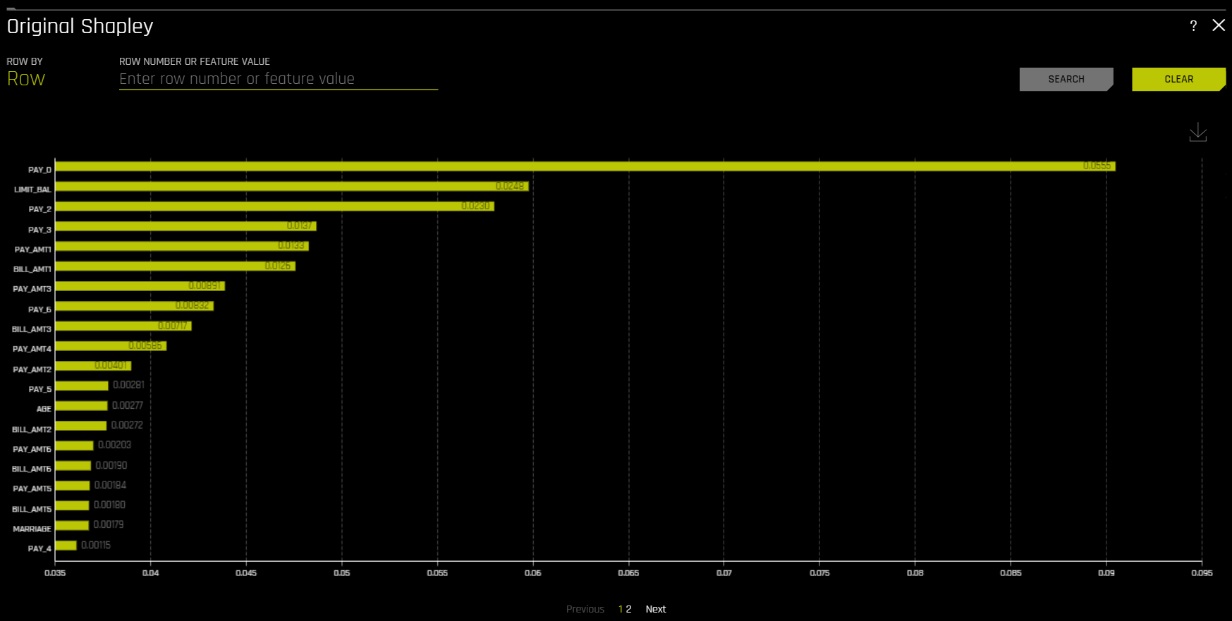
The Showing \(n\) Features dropdown for Feature Importance and Shapley plots allows you to select between original and transformed features. If there are a significant amount of features, they will be organized in numbered pages that can be viewed individually. Note: The provided original values are approximations derived from the accompanying transformed values. For example, if the transformed feature \(feature1\_feature2\) has a value of 0.5, then the value of the original features (\(feature1\) and \(feature2\)) will be 0.25.
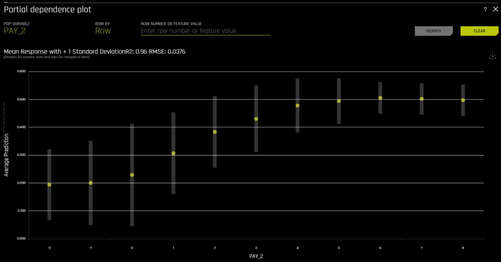
Partial Dependence (PDP) and Individual Conditional Expectation (ICE)
A Partial Dependence and ICE plot is available for both Driverless AI and surrogate models.
The Partial Dependence Technique
Partial dependence is a measure of the average model prediction with respect to an input variable. Partial dependence plots display how machine-learned response functions change based on the values of an input variable of interest, while taking nonlinearity into consideration and averaging out the effects of all other input variables. Partial dependence plots are well-known and described in the Elements of Statistical Learning (Hastie et al, 2001). Partial dependence plots enable increased transparency in Driverless AI models and the ability to validate and debug Driverless AI models by comparing a variable’s average predictions across its domain to known standards, domain knowledge, and reasonable expectations.
The ICE Technique
This plot is available for binary classification and regression models.
Individual conditional expectation (ICE) plots, a newer and less well-known adaptation of partial dependence plots, can be used to create more localized explanations for a single individual using the same basic ideas as partial dependence plots. ICE Plots were described by Goldstein et al (2015). ICE values are simply disaggregated partial dependence, but ICE is also a type of nonlinear sensitivity analysis in which the model predictions for a single row are measured while a variable of interest is varied over its domain. ICE plots enable a user to determine whether the model’s treatment of an individual row of data is outside one standard deviation from the average model behavior, whether the treatment of a specific row is valid in comparison to average model behavior, known standards, domain knowledge, and reasonable expectations, and how a model will behave in hypothetical situations where one variable in a selected row is varied across its domain.
Given the row of input data with its corresponding Driverless AI and K-LIME predictions:
debt_to_income_ ratio |
credit_ score |
savings_acct_ balance |
observed_ default |
H2OAI_predicted_ default |
K-LIME_predicted_ default |
|---|---|---|---|---|---|
30 |
600 |
1000 |
1 |
0.85 |
0.9 |
Taking the Driverless AI model as F(X), assuming credit scores vary from 500 to 800 in the training data, and that increments of 30 are used to plot the ICE curve, ICE is calculated as follows:
\(\text{ICE}_{credit\_score, 500} = F(30, 500, 1000)\)
\(\text{ICE}_{credit\_score, 530} = F(30, 530, 1000)\)
\(\text{ICE}_{credit\_score, 560} = F(30, 560, 1000)\)
\(...\)
\(\text{ICE}_{credit\_score, 800} = F(30, 800, 1000)\)
The one-dimensional partial dependence plots displayed here do not take interactions into account. Large differences in partial dependence and ICE are an indication that strong variable interactions may be present. In this case partial dependence plots may be misleading because average model behavior may not accurately reflect local behavior.
The Partial Dependence Plot
This plot is available for binary classification and regression models.
Overlaying ICE plots onto partial dependence plots allow the comparison of the Driverless AI model’s treatment of certain examples or individuals to the model’s average predictions over the domain of an input variable of interest.
This plot shows the partial dependence when a variable is selected and the ICE values when a specific row is selected. Users may select a point on the graph to see the specific value at that point. Partial dependence (yellow) portrays the average prediction behavior of the Driverless AI model across the domain of an input variable along with +/- 1 standard deviation bands. ICE (grey) displays the prediction behavior for an individual row of data when an input variable is toggled across its domain. Currently, partial dependence and ICE plots are only available for the top ten most important original input variables. Categorical variables with 20 or more unique values are never included in these plots.
Disparate Impact Analysis
This plot is available for binary classification and regression models.
DIA is a technique that is used to evaluate fairness. Bias can be introduced to models during the process of collecting, processing, and labeling data—as a result, it is important to determine whether a model is harming certain users by making a significant number of biased decisions.
DIA typically works by comparing aggregate measurements of unprivileged groups to a privileged group. For instance, the proportion of the unprivileged group that receives the potentially harmful outcome is divided by the proportion of the privileged group that receives the same outcome—the resulting proportion is then used to determine whether the model is biased. Refer to the Summary section to determine if a categorical level (for example, Fairness Female) is fair in comparison to the specified reference level and user-defined thresholds. Fairness All is a true or false value that is only true if every category is fair in comparison to the reference level.
Disparate impact testing is best suited for use with constrained models in Driverless AI, such as linear models, monotonic GBMs, or RuleFit. The average group metrics reported in most cases by DIA may miss cases of local discrimination, especially with complex, unconstrained models that can treat individuals very differently based on small changes in their data attributes.
DIA allows you to specify a disparate impact variable (the group variable that is analyzed), a reference level (the group level that other groups are compared to), and user-defined thresholds for disparity. Several tables are provided as part of the analysis:
Group metrics: The aggregated metrics calculated per group. For example, true positive rates per group.
Group disparity: This is calculated by dividing the
metric_for_groupby thereference_group_metric. Disparity is observed if this value falls outside of the user-defined thresholds.Group parity: This builds on Group disparity by converting the above calculation to a true or false value by applying the user-defined thresholds to the disparity values.
In accordance with the established four-fifths rule, user-defined thresholds are set to 0.8 and 1.25 by default. These thresholds will generally detect if the model is (on average) treating the non-reference group 20% more or less favorably than the reference group. Users are encouraged to set the user-defined thresholds to align with their organization’s guidance on fairness thresholds.
Metrics - Binary Classification
The following are formulas for error metrics and parity checks utilized by binary DIA. Note that in the tables below:
tp = true positive
fp = false positive
tn = true negative
fn = false negative
Error Metric / Parity Metric |
Formula |
Adverse Impact |
(tp + fp) / (tp + tn + fp + fn) |
Accuracy |
(tp + tn) / (tp + tn + fp + fn) |
True Positive Rate |
tp / (tp + fn) |
Precision |
tp / (tp + fp) |
Specificity |
tn / (tn + fp) |
Negative Predicted Value |
tn / (tn + fn) |
False Positive Rate |
fp / (tn + fp) |
False Discovery Rate |
fp / (tp + fp) |
False Negative Rate |
fn / (tp + fn) |
False Omissions Rate |
fn / (tn + fn) |
Parity Check |
Description |
|
|---|---|---|
Type I Parity |
Fairness in both FDR Parity and FPR Parity |
|
Type II Parity |
Fairness in both FOR Parity and FNR Parity |
|
Equalized Odds |
Fairness in both FPR Parity and TPR Parity |
|
Supervised Fairness |
Fairness in both Type I and Type II Parity |
|
Overall Fairness |
Fairness across all parities for all metrics where:
|
|
Metrics - Regression
The following are metrics utilized by regression DIA:
Mean Prediction: The mean of all predictions
Std.Dev Prediction: The standard deviation of all predictions
Maximum Prediction: The prediction with the highest value
Minimum Prediction: The prediction with the lowest value
R2: The measure that represents the proportion of the variance for a dependent variable that is explained by an independent variable or variables
RMSE: The measure of the differences between values predicted by a model and the values actually observed
Fairness Metrics
DIA calculates Marginal Error (ME), Adverse Impact Ratio (AIR), and Standardized Mean Difference (SMD) for binary models and SMD for regression models.
ME is the difference between the percent of the control group members receiving a favorable outcome and the percent of the protected class members receiving a favorable outcome:
\[\text{ME} \equiv 100 \cdot (\text{PR} (\hat{y} = 1 \vert X_c = 1) - \text{Pr}(\hat{y} = 1 \vert X_p = 1))\]
Where:
\(\hat{y}\) is the model decisions.
\(X_c\) and \(X_p\) are binary markers created from some demographic attribute.
\(c\) is the control group.
\(p\) is the protected group.
\(Pr(\cdot)\) is the operator for conditional probability.
AIR is equal to the ratio of the proportion of the protected class that receives a favorable outcome and the proportion of the control class that receives a favorable outcome:
\[\text{AIR} \equiv \frac{Pr(\hat{y} \; = 1 \vert X_p = 1)}{Pr(\hat{y} \; = 1 \vert X_c = 1)}\]
Where:
\(\hat{y}\) is the model decisions.
\(X_p\) and \(X_c\) are binary markers created from some demographic attribute.
\(c\) is the control group.
\(p\) is the protected group.
\(Pr(·)\) is the operator for conditional probability.
SMD is used to assess disparities in continuous features such as income differences in employment analyses or interest rate differences in lending:
\[\text{SMD} \equiv \frac{\bar{\hat y_p} - \bar{\hat y_c}}{\sigma_{\hat y}}\]
Where:
\(\bar{\hat y_p}\) is the difference in the average protected class outcome.
\(\bar{\hat y_c}\) is the control class outcome.
\(\sigma_{\hat y}\) is a measure of the standard deviation of the population.
Notes:
Although the process of DIA is the same for both classification and regression experiments, the returned information is dependent on the type of experiment being interpreted. An analysis of a regression experiment returns an actual vs. predicted plot, while an analysis of a binary classification experiment returns confusion matrices.
Users are encouraged to consider the explanation dashboard to understand and augment results from disparate impact analysis. In addition to its established use as a fairness tool, users may want to consider disparate impact for broader model debugging purposes. For example, users can analyze the supplied confusion matrices and group metrics for important, non-demographic features in the Driverless AI model.
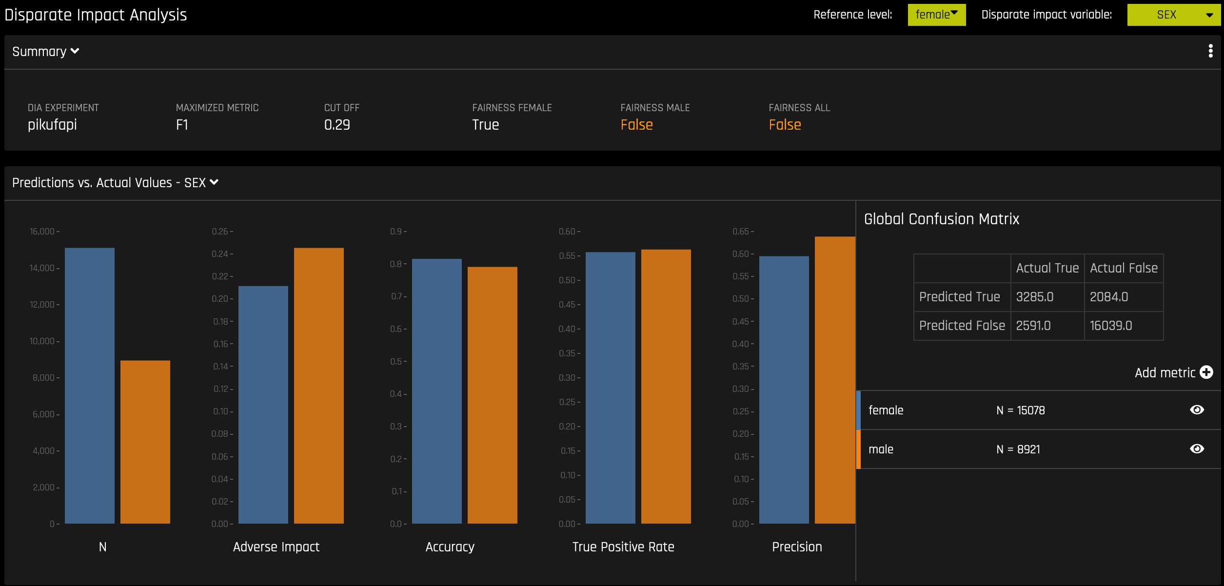
Classification Experiment
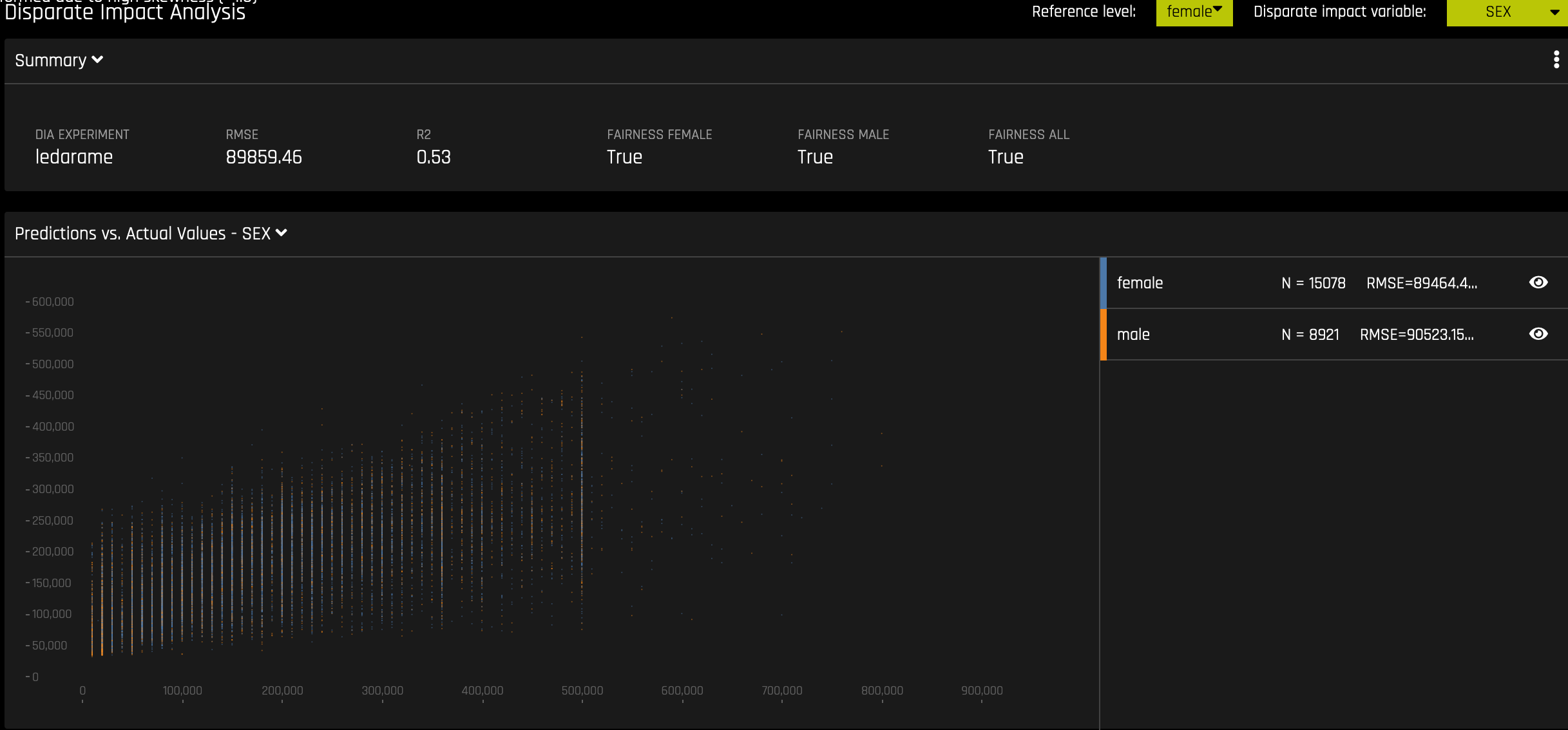
Regression Experiment
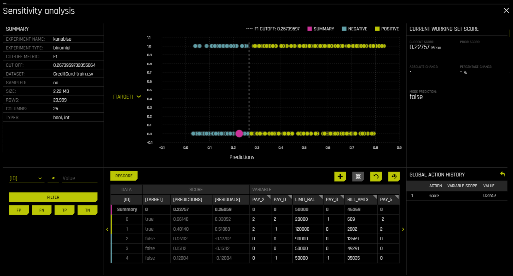
Sensitivity Analysis
Note: Sensitivity Analysis (SA) is not available for multiclass experiments.
Sensitivity Analysis (or “What if?”) is a simple and powerful model debugging, explanation, fairness, and security tool. The idea behind SA is both direct and simple: Score your trained model on a single row, on multiple rows, or on an entire dataset of potentially interesting simulated values and compare the model’s new outcome to the predicted outcome on the original data.
Beyond traditional assessment practices, sensitivity analysis of machine learning model predictions is perhaps the most important validation technique for machine learning models. Sensitivity analysis investigates whether model behavior and outputs remain stable when data is intentionally perturbed or other changes are simulated in the data. Machine learning models can make drastically differing predictions for only minor changes in input variable values. For example, when looking at predictions that determine financial decisions, SA can be used to help you understand the impact of changing the most important input variables and the impact of changing socially sensitive variables (such as Sex, Age, Race, etc.) in the model. If the model changes in reasonable and expected ways when important variable values are changed, this can enhance trust in the model. Similarly, if the model changes to sensitive variables have minimal impact on the model, then this is an indication of fairness in the model predictions.
This page utilizes the What If Tool for displaying the SA information.
The top portion of this page includes:
A summary of the experiment
Predictions for a specified column. Change the column on the Y axis to view predictions for that column.
The current working score set. This updates each time you rescore.
The bottom portion of this page includes:
A filter tool for filtering the analysis. Choose a different column, predictions, or residuals. Set the filter type (
<,>, etc.). Choose to filter by False Positive, False Negative, True Positive, or True Negative.Scoring chart. Click the Rescore button after applying a filter to update the scoring chart. This chart also allows you to add or remove variables, toggle the main chart aggregation, reset the data, and delete the global history while resetting the data.
The current history of actions taken on this page. You can delete individual actions by selecting the action and then clicking the Delete button that appears.
Use Case 1: Using SA on a Single Row or on a Small Group of Rows
This section describes scenarios for using SA for explanation, debugging, security, or fairness when scoring a trained model on a single row or on a small group of rows.
Explanation: Change values for a variable, and then rescore the model. View the difference between the original prediction and the new model prediction. If the change is big, then the changed variable is locally important.
Debugging: Change values for a variable, and then rescore the model. View the difference between the original prediction and the new model prediction and determine whether the change to variable made the model more or less accurate.
Security: Change values for a variable, and then rescore the model. View the difference between the original prediction and the new model prediction. If the change is big, then the user can, for example, inform their IT department that this variable can be used in an adversarial attack or inform the model makers that this variable should be more regularized.
Fairness: Change values for a demographic variable, and then rescore the model. View the difference between the original prediction and the new model prediction. If change is big, then the user can consider using a different model, regularizing the model more, or applying post-hoc bias remediation techniques.
Random: Set variables to random values, and then rescore the model. This can help you look for things the you might not have thought of.
Use Case 2: Using SA on an Entire Dataset and Trained Model
This section describes scenarios for using SA for explanation, debugging, security, or fairness when scoring a trained model for an entire dataset and trained predictive model.
Financial Stress Testing: Assume the user wants to see how their loan default rates will change (according to their trained probability of default model) when they change an entire dataset to simulate that all their customers are under more financial stress (such as lower FICO scores, lower savings balances, higher unemployment, etc). Change the values of the variables in their entire dataset, and look at the Percentage Change in the average model score (default probability) on the original and new data. They can then use this discovered information along with external information and processes to understand whether their institution has enough cash on hand to be prepared for the simulated crisis.
Random: Set variables to random values, and then rescore the model. This allows the user to look for things the user might not have thought of.
Additional Resources
Sensitivity Analysis on a Driverless AI Model: This ipynb uses the UCI credit card default data to perform sensitivity analysis and test model performance.
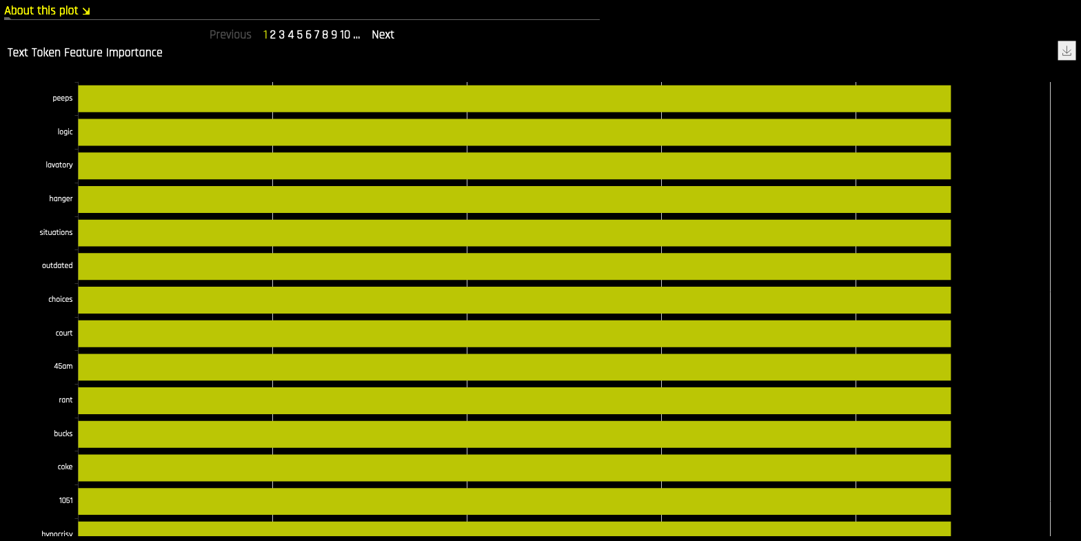
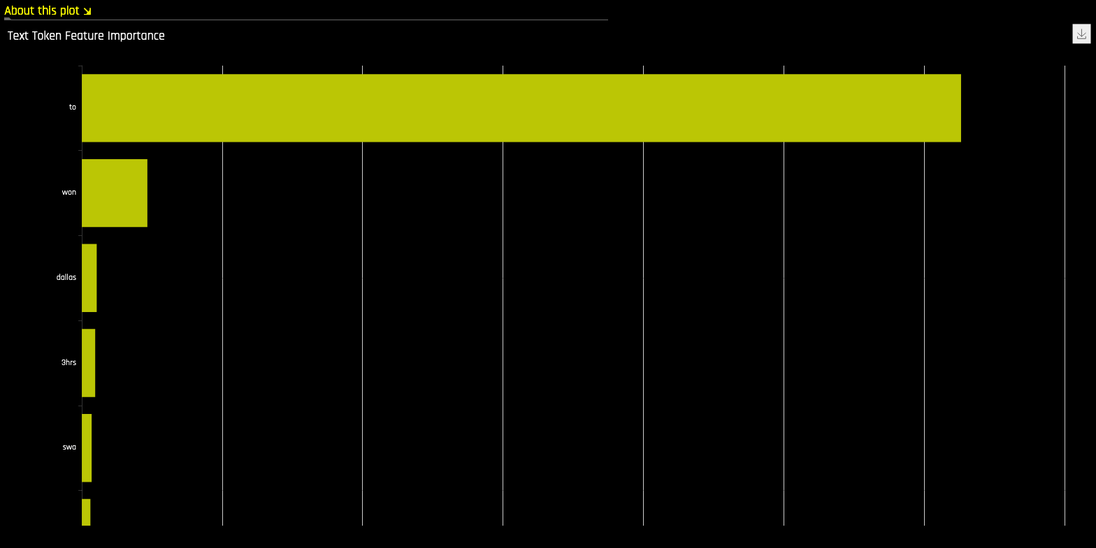
NLP Tokens
This plot is available for natural language processing (NLP) models. It is located in the Dataset tab on the Model Interpretation page (only visible for NLP models).
This plot shows both the global and local importance values of each token in a corpus (a large and structured set of texts). The corpus is automatically generated from text features used by Driverless AI models prior to the process of tokenization.
Local importance values are calculated by using the term frequency–inverse document frequency (TFIDF) as a weighting factor for each token in each row. The TFIDF increases proportionally to the number of times a token appears in a given document and is offset by the number of documents in the corpus that contain the token. Specify the row that you want to view, then click the Search button to see the local importance of each token in that row.
Global importance values are calculated by using the inverse document frequency (IDF), which measures how common or rare a given token is across all documents. (Default View)
Notes:
MLI support for NLP is not available for multinomial experiments.
MLI for NLP does not currently feature the option to remove stop words.
By default, up to 10,000 tokens are created during the tokenization process. This value can be changed in the configuration.
By default, Driverless AI uses up to 10,000 documents to extract tokens from. This value can be changed with the
config.mli_nlp_sample_limitparameter. Downsampling is used for datasets that are larger than the default sample limit.Driverless AI does not currently generate a K-LIME scoring pipeline for MLI NLP problems.
NLP LOCO
This plot is available for natural language processing (NLP) models.
This plot applies a leave-one-covariate-out (LOCO) styled approach to NLP models by removing a specific token from all text features in a record and predicting local importance without that token. The difference between the resulting score and the original score (token included) is useful when trying to determine how specific changes to text features alter the predictions made by the model.
Notes:
MLI support for NLP is not available for multinomial experiments.
Due to computational complexity, the global importance value is only calculated for \(N\) (20 by default) tokens. This value can be changed with the
mli_nlp_top_nconfiguration option.A specific token selection method can be used by specifying one of the following options for the
mli_nlp_min_token_modeconfiguration option:
linspace: Selects \(N\) evenly spaced tokens according to their IDF score (Default)
top: Selects top \(N\) tokens by IDF score
bottom: Selects bottom \(N\) tokens by IDF score
Local values for NLP LOCO can take a significant amount of time to calculate depending on the specifications of your hardware.
Driverless AI does not currently generate a K-LIME scoring pipeline for MLI NLP problems.
Permutation Feature Importance
Note: The Permutation-based feature importance plot is only available if the autodoc_include_permutation_feature_importance configuration option was enabled when starting Driverless AI or when starting the experiment. In addition, this plot is only available for binary classification and regression experiments.
Permutation-based feature importance shows how much a model’s performance would change if a feature’s values were permuted. If the feature has little predictive power, shuffling its values should have little impact on the model’s performance. If a feature is highly predictive, however, shuffling its values should decrease the model’s performance. The difference between the model’s performance before and after permuting the feature provides the feature’s absolute permutation importance.
Surrogate Model Tab Plots
This section describes the plots that are available in the Surrogate Model Tab.
K-LIME and LIME-SUP
The MLI screen includes a K-LIME or LIME-SUP graph. A K-LIME graph is available by default when you interpret a model from the experiment page. When you create a new interpretation, you can instead choose to use LIME-SUP as the LIME method. Note that these graphs are essentially the same, but the K-LIME/LIME-SUP distinction provides insight into the LIME method that was used during model interpretation.
The K-LIME Technique
This plot is available for binary classification and regression models.
K-LIME is a variant of the LIME technique proposed by Ribeiro at al (2016). K-LIME generates global and local explanations that increase the transparency of the Driverless AI model, and allow model behavior to be validated and debugged by analyzing the provided plots, and comparing global and local explanations to one-another, to known standards, to domain knowledge, and to reasonable expectations.
K-LIME creates one global surrogate GLM on the entire training data and also creates numerous local surrogate GLMs on samples formed from k-means clusters in the training data. The features used for k-means are selected from the Random Forest surrogate model’s variable importance. The number of features used for k-means is the minimum of the top 25% of variables from the Random Forest surrogate model’s variable importance and the max number of variables that can be used for k-means, which is set by the user in the config.toml setting for mli_max_number_cluster_vars. (Note, if the number of features in the dataset are less than or equal to 6, then all features are used for k-means clustering.) The previous setting can be turned off to use all features for k-means by setting use_all_columns_klime_kmeans in the config.toml file to true. All penalized GLM surrogates are trained to model the predictions of the Driverless AI model. The number of clusters for local explanations is chosen by a grid search in which the \(R^2\) between the Driverless AI model predictions and all of the local K-LIME model predictions is maximized. The global and local linear model’s intercepts, coefficients, \(R^2\) values, accuracy, and predictions can all be used to debug and develop explanations for the Driverless AI model’s behavior.
The parameters of the global K-LIME model give an indication of overall linear feature importance and the overall average direction in which an input variable influences the Driverless AI model predictions. The global model is also used to generate explanations for very small clusters (\(N < 20\)) where fitting a local linear model is inappropriate.
The in-cluster linear model parameters can be used to profile the local region, to give an average description of the important variables in the local region, and to understand the average direction in which an input variable affects the Driverless AI model predictions. For a point within a cluster, the sum of the local linear model intercept and the products of each coefficient with their respective input variable value are the K-LIME prediction. By disaggregating the K-LIME predictions into individual coefficient and input variable value products, the local linear impact of the variable can be determined. This product is sometimes referred to as a reason code and is used to create explanations for the Driverless AI model’s behavior.
In the following example, reason codes are created by evaluating and disaggregating a local linear model.
Given the row of input data with its corresponding Driverless AI and K-LIME predictions:
debt_to_income_ ratio |
credit_ score |
savings_acct_ balance |
observed_ default |
H2OAI_predicted_ default |
K-LIME_predicted_ default |
|---|---|---|---|---|---|
30 |
600 |
1000 |
1 |
0.85 |
0.9 |
And the local linear model:
\(\small{y_\text{K-LIME} = 0.1 + 0.01 * debt\_to\_income\_ratio + 0.0005 * credit\_score + 0.0002 * savings\_account\_balance}\)
It can be seen that the local linear contributions for each variable are:
debt_to_income_ratio: 0.01 * 30 = 0.3
credit_score: 0.0005 * 600 = 0.3
savings_acct_balance: 0.0002 * 1000 = 0.2
Each local contribution is positive and thus contributes positively to the Driverless AI model’s prediction of 0.85 for H2OAI_predicted_default. By taking into consideration the value of each contribution, reason codes for the Driverless AI decision can be derived. debt_to_income_ratio and credit_score would be the two largest negative reason codes, followed by savings_acct_balance.
The local linear model intercept and the products of each coefficient and corresponding value sum to the K-LIME prediction. Moreover it can be seen that these linear explanations are reasonably representative of the nonlinear model’s behavior for this individual because the K-LIME predictions are within 5.5% of the Driverless AI model prediction. This information is encoded into English language rules which can be viewed by clicking the Explanations button.
Like all LIME explanations based on linear models, the local explanations are linear in nature and are offsets from the baseline prediction, or intercept, which represents the average of the penalized linear model residuals. Of course, linear approximations to complex non-linear response functions will not always create suitable explanations and users are urged to check the K-LIME plot, the local model \(R^2\), and the accuracy of the K-LIME prediction to understand the validity of the K-LIME local explanations. When K-LIME accuracy for a given point or set of points is quite low, this can be an indication of extremely nonlinear behavior or the presence of strong or high-degree interactions in this local region of the Driverless AI response function. In cases where K-LIME linear models are not fitting the Driverless AI model well, nonlinear LOCO feature importance values may be a better explanatory tool for local model behavior. As K-LIME local explanations rely on the creation of k-means clusters, extremely wide input data or strong correlation between input variables may also degrade the quality of K-LIME local explanations.
The LIME-SUP Technique
This plot is available for binary classification and regression models.
LIME-SUP explains local regions of the trained Driverless AI model in terms of the original variables. Local regions are defined by each leaf node path of the decision tree surrogate model instead of simulated, perturbed observation samples - as in the original LIME. For each local region, a local GLM model is trained on the original inputs and the predictions of the Driverless AI model. Then the parameters of this local GLM can be used to generate approximate, local explanations of the Driverless AI model.
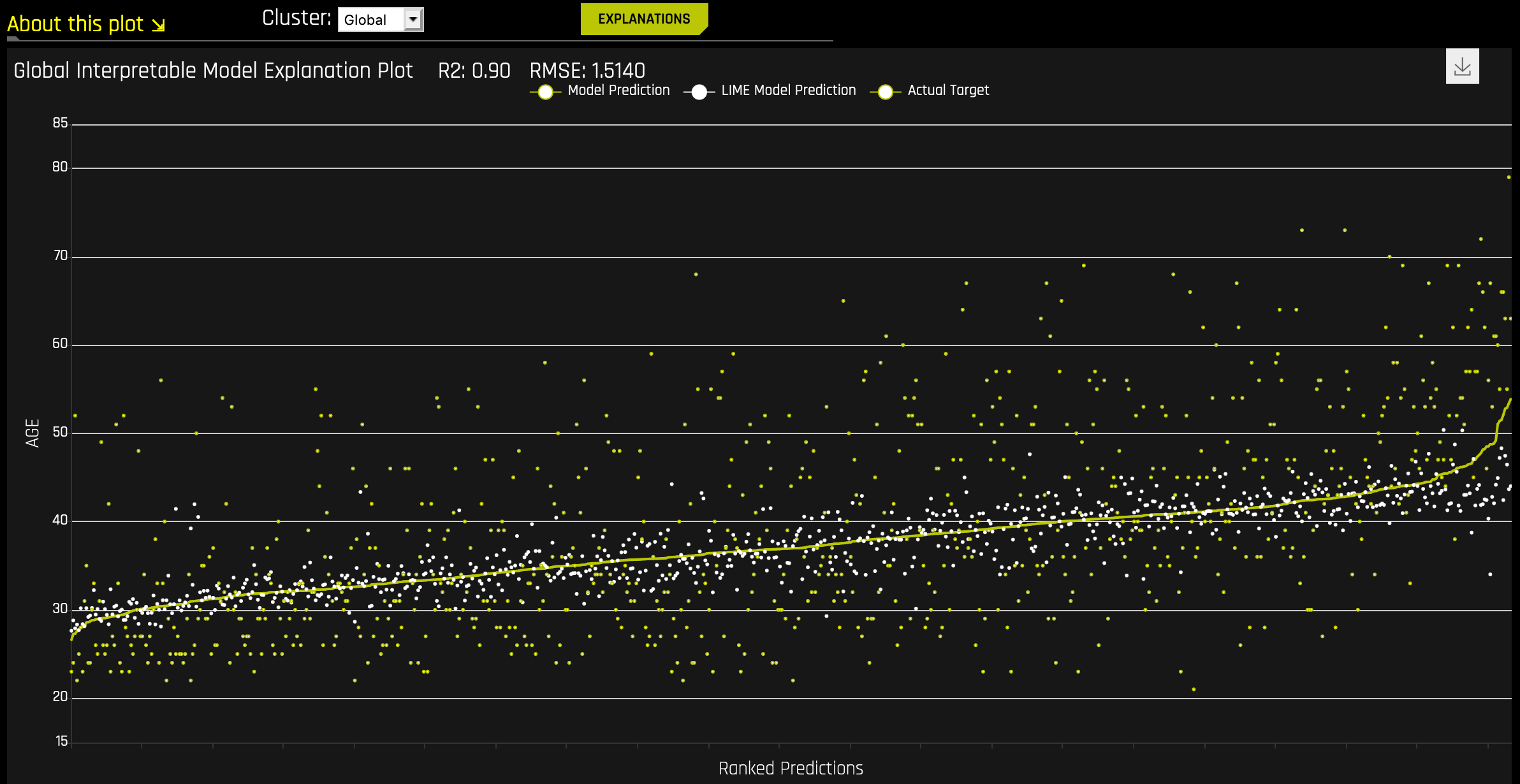
The Global Interpretable Model Explanation Plot
This plot shows Driverless AI model predictions and LIME model predictions in sorted order by the Driverless AI model predictions. This graph is interactive. Hover over the Model Prediction, LIME Model Prediction, or Actual Target radio buttons to magnify the selected predictions. Or click those radio buttons to disable the view in the graph. You can also hover over any point in the graph to view LIME reason codes for that value. By default, this plot shows information for the global LIME model, but you can change the plot view to show local results from a specific cluster. The LIME plot also provides a visual indication of the linearity of the Driverless AI model and the trustworthiness of the LIME explanations. The closer the local linear model approximates the Driverless AI model predictions, the more linear the Driverless AI model and the more accurate the explanation generated by the LIME local linear models.
Decision Tree
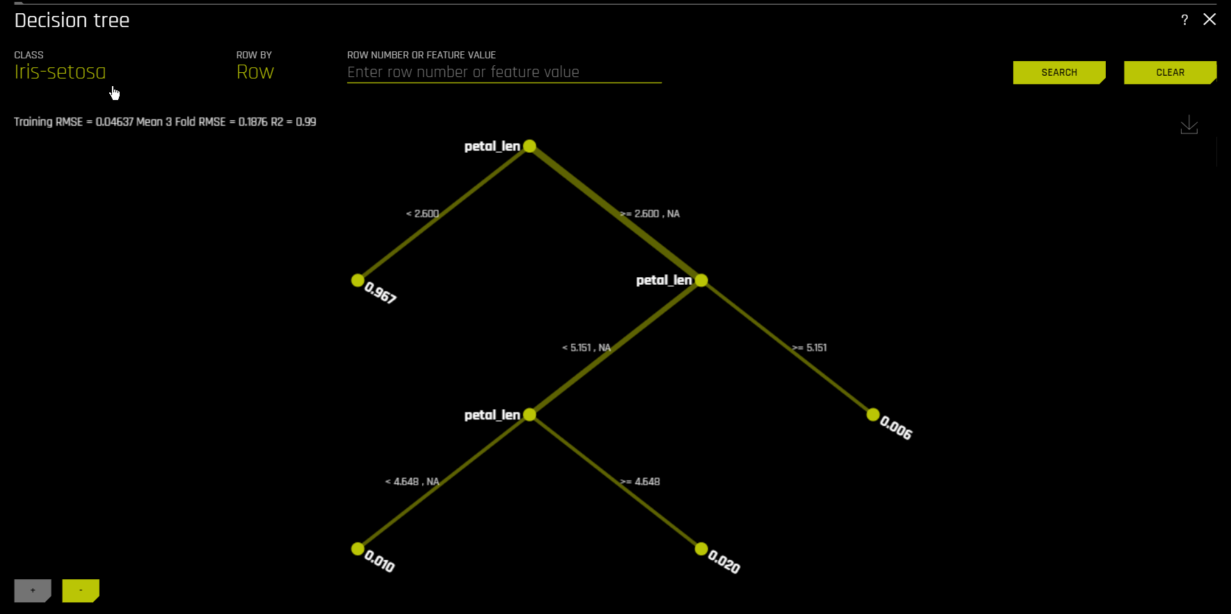
The Decision Tree Surrogate Model Technique
The decision tree surrogate model increases the transparency of the Driverless AI model by displaying an approximate flow-chart of the complex Driverless AI model’s decision making process. It also displays the most important variables in the Driverless AI model and the most important interactions in the Driverless AI model. The decision tree surrogate model can be used for visualizing, validating, and debugging the Driverless AI model by comparing the displayed decision-process, important variables, and important interactions to known standards, domain knowledge, and reasonable expectations. It is known to date back at least to 1996 (Craven and Shavlik).
The Decision Tree Plot
This plot is available for binary and multinomial classification models as well as regression models.
In the Decision Tree plot, the highlighted row shows the path to the highest probability leaf node and indicates the globally important variables and interactions that influence the Driverless AI model prediction for that row.
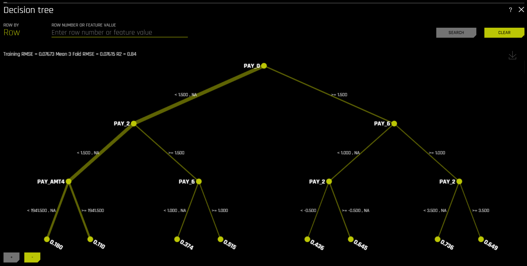
For multinomial models, decision trees are created for each class. To view a decision tree for a specific class, click Class in the upper-left corner of the page and select the class you want to view a decision tree for.
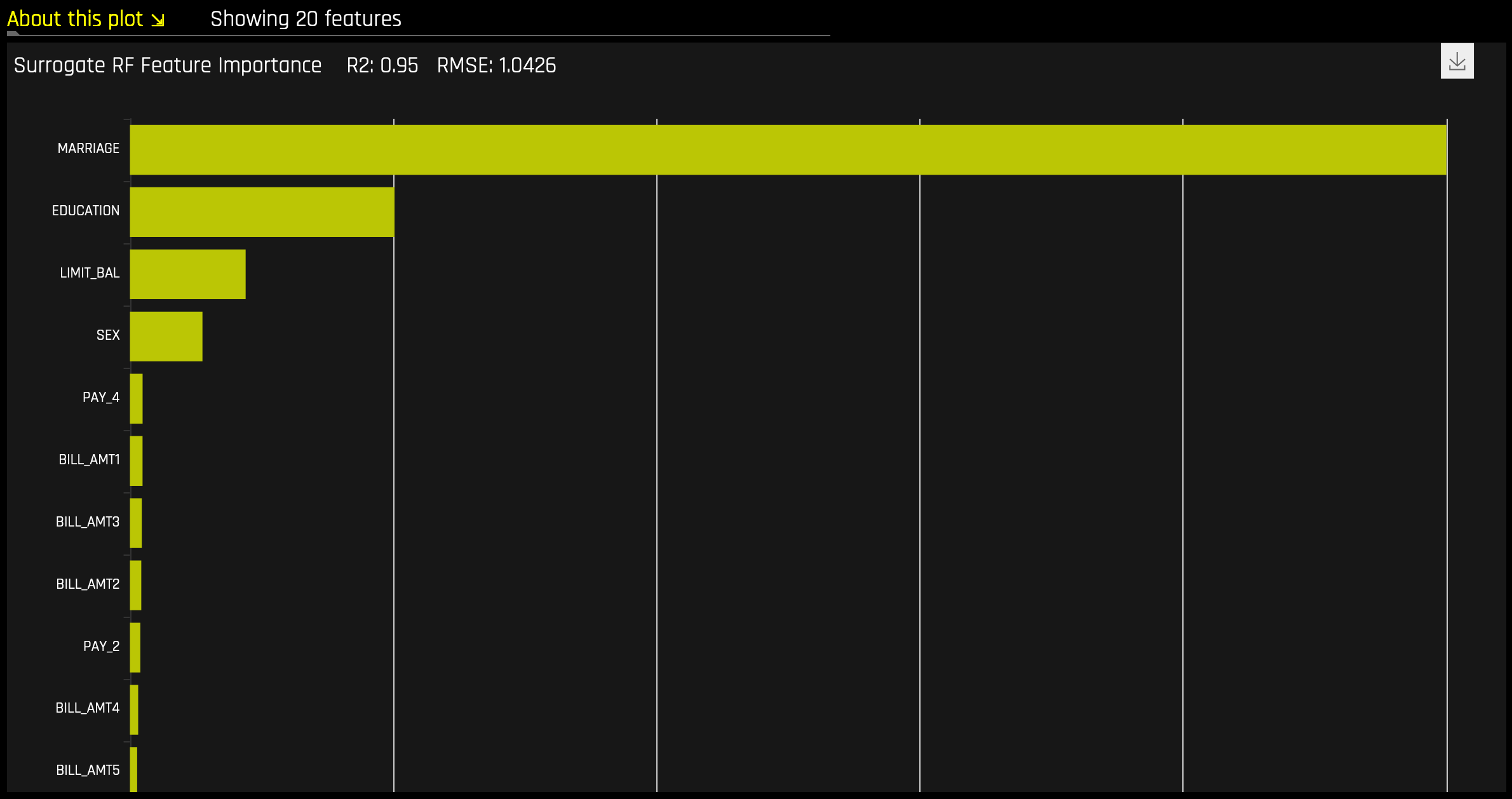
Random Forest Feature Importance
Global Feature Importance vs Local Feature Importance
Global feature importance (yellow) is a measure of the contribution of an input variable to the overall predictions of the Driverless AI model. Global feature importance is calculated by aggregating the improvement in splitting criterion caused by a single variable across all of the decision trees in the Driverless AI model.
Local feature importance (grey) is a measure of the contribution of an input variable to a single prediction of the Driverless AI model. Local feature importance is calculated by removing the contribution of a variable from every decision tree in the Driverless AI model and measuring the difference between the prediction with and without the variable.
Both global and local variable importance are scaled so that the largest contributor has a value of 1.
Note: Engineered features are used for MLI when a time series experiment is built. This is because munged time series features are more useful features for MLI than raw time series features, as raw time series features are not IID (Independent and Identically Distributed).
Random Forest Partial Dependence and Individual Conditional Expectation
A Partial Dependence and ICE plot is available for both Driverless AI and surrogate models. Refer to the previous Partial Dependence (PDP) and Individual Conditional Expectation (ICE) section for more information about this plot.
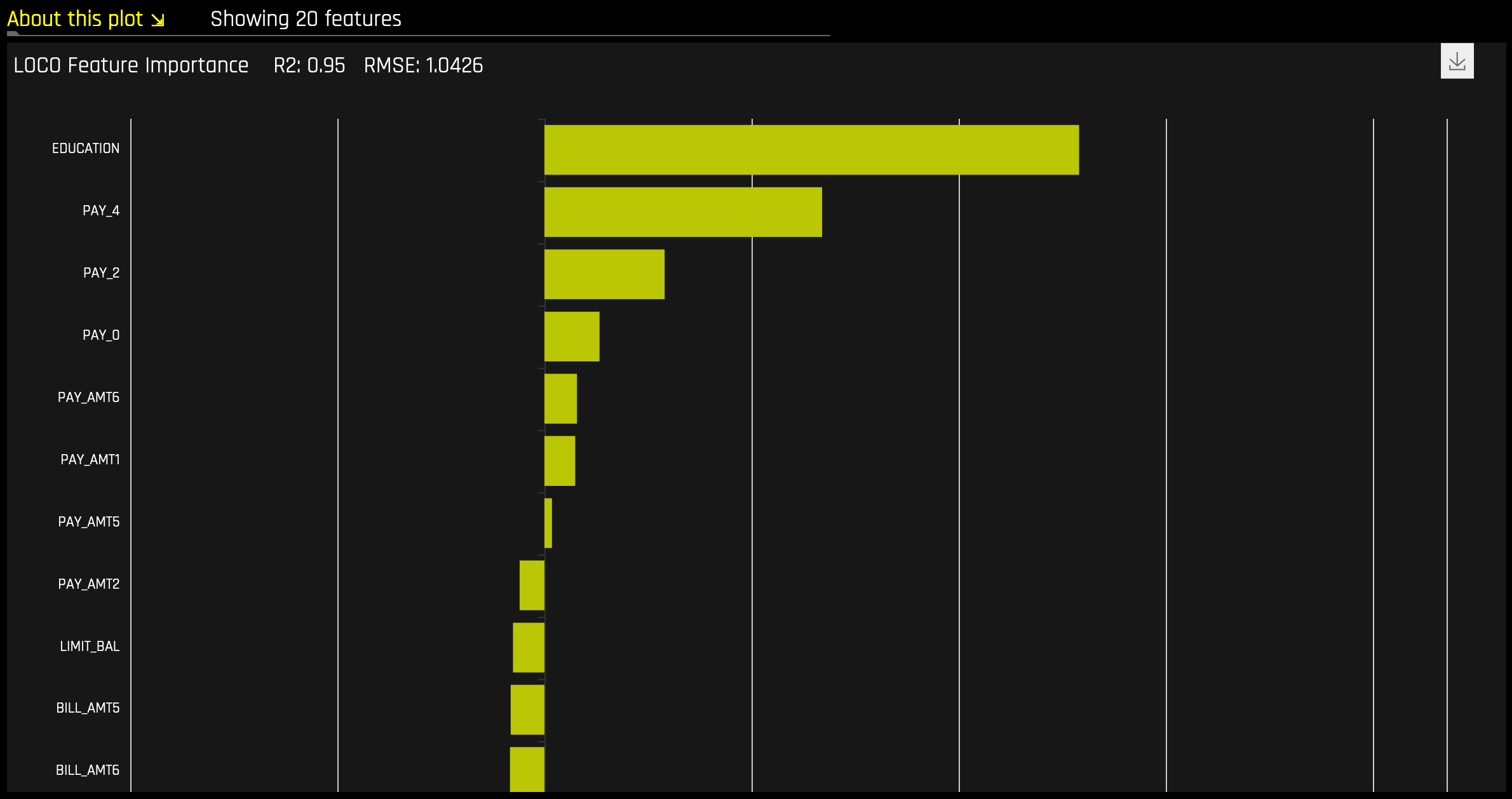
Random Forest LOCO
This plot is available for binary and multinomial classification models as well as regression models.
Local feature importance describes how the combination of the learned model rules or parameters and an individual row’s attributes affect a model’s prediction for that row while taking nonlinearity and interactions into effect. Local feature importance values reported in this plot are based on a variant of the leave-one-covariate-out (LOCO) method (Lei et al, 2017).
The LOCO-variant method for binary and regression models calculates each local feature importance by re-scoring the trained Driverless AI model for each feature in the row of interest, while removing the contribution to the model prediction of splitting rules that contain that feature throughout the ensemble. The original prediction is then subtracted from this modified prediction to find the raw, signed importance for the feature. All local feature importance values for the row are then scaled between 0 and 1 for direct comparison with global feature importance values.
The LOCO-variant method for multinomial models differs slightly in that it calculates row-wise local feature importance values by re-scoring the trained supervised model and measuring the impact of setting each variable to missing. The sum of the absolute value of differences across classes is then calculated for each dropped or replaced column.
Given the row of input data with its corresponding Driverless AI and K-LIME predictions:
debt_to_income_ ratio |
credit_ score |
savings_acct_ balance |
observed_ default |
H2OAI_predicted_ default |
K-LIME_predicted_ default |
|---|---|---|---|---|---|
30 |
600 |
1000 |
1 |
0.85 |
0.9 |
Taking the Driverless AI model as F(X), LOCO-variant feature importance values are calculated as follows.
First, the modified predictions are calculated:
\(F_{~debt\_to\_income\_ratio} = F(NA, 600, 1000) = 0.99\)
\(F_{~credit\_score} = F(30, NA, 1000) = 0.73\)
\(F_{~savings\_acct\_balance} = F(30, 600, NA) = 0.82\)
Second, the original prediction is subtracted from each modified prediction to generate the unscaled local feature importance values:
\(\text{LOCO}_{debt\_to\_income\_ratio} = F_{~debt\_to\_income\_ratio} - 0.85 = 0.99 - 0.85 = 0.14\)
\(\text{LOCO}_{credit\_score} = F_{~credit\_score} - 0.85 = 0.73 - 0.85 = -0.12\)
\(\text{LOCO}_{savings\_acct\_balance} = F_{~savings\_acct\_balance} - 0.85 = 0.82 - 0.85 = -0.03\)
Finally LOCO values are scaled between 0 and 1 by dividing each value for the row by the maximum value for the row and taking the absolute magnitude of this quotient.
\(\text{Scaled}(\text{LOCO}_{debt\_to\_income\_ratio}) = \text{Abs}(\text{LOCO}_{~debt\_to\_income\_ratio}/0.14) = 1\)
\(\text{Scaled}(\text{LOCO}_{credit\_score}) = \text{Abs}(\text{LOCO}_{~credit\_score}/0.14) = 0.86\)
\(\text{Scaled}(\text{LOCO}_{savings\_acct\_balance}) = \text{Abs}(\text{LOCO}_{~savings\_acct\_balance} / 0.14) = 0.21\)
One drawback to these LOCO-variant feature importance values is, unlike K-LIME, it is difficult to generate a mathematical error rate to indicate when LOCO values may be questionable.
NLP Surrogate Models
These plots are available for natural language processing (NLP) models.
For NLP surrogate models, Driverless AI creates a TFIDF matrix by tokenizing all text features. The resulting frame is appended to numerical or categorical columns from the training dataset, and the original text columns are removed. This frame is then used for training surrogate models that have prediction columns consisting of tokens and the original numerical or categorical features.
Notes:
MLI support for NLP is not available for multinomial experiments.
Each row in the TFIDF matrix contains \(N\) columns, where \(N\) is the total number of tokens in the corpus with values that are appropriate for that row (0 if absent).
Driverless AI does not currently generate a K-LIME scoring pipeline for MLI NLP problems.
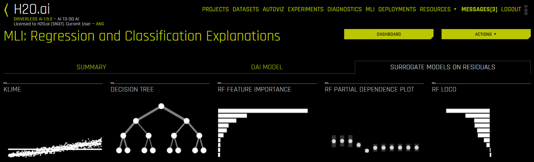
Running Surrogate Models on Residuals
In Driverless AI, residuals (differences between observed and predicted values) can be used as targets in MLI surrogate models for the purpose of debugging models. The method used to calculate residuals varies depending on the type of problem. For classification problems, logloss residuals are calculated for a specified class. For regression problems, residuals are determined by calculating the square of the difference between targeted and predicted values.
To run MLI surrogate models on residuals, enable the Debug Model Residuals interpretation expert setting. For classification experiments, specify a class to use as an outcome of interest with the Class for Debugging Classification Model Logloss Residuals interpretation expert setting (not visible for regression problems). You can view the models by clicking the Surrogate Models on Residuals tab once the interpretation is complete.